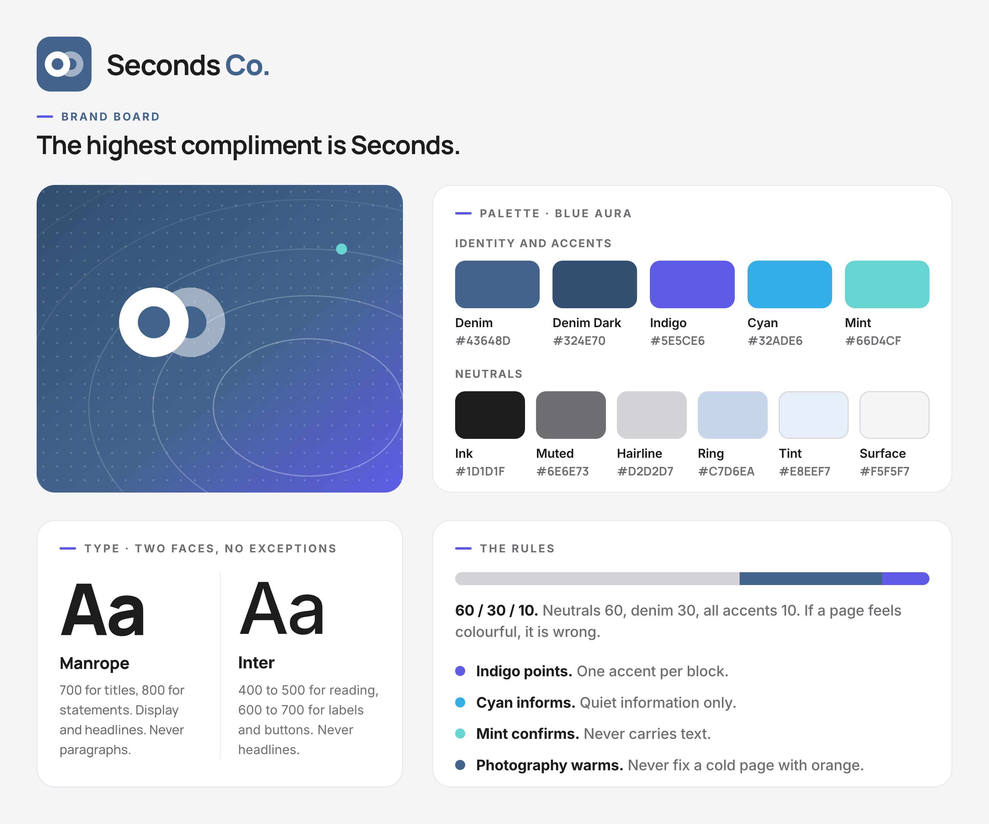
The icon sets the tone, Blue Aura gives it a place to live, four colour rules keep it quiet enough to read. Manrope says it loud. Inter says it clearly.
Palette · Blue Aura
Identity and accents
Denim#43648D
Denim Dark#324E70
Indigo#5E5CE6
Cyan#32ADE6
Mint#66D4CF
Neutrals
Ink#1D1D1F
Muted#6E6E73
Hairline#D2D2D7
Ring#C7D6EA
Tint#E8EEF7
Surface#F5F5F7
Type · two faces, no exceptions
Aa
Manrope
700 for titles, 800 for statements. Display and headlines. Never paragraphs.
Aa
Inter
400 to 500 for reading, 600 to 700 for labels and buttons. Never headlines.
Read it cover to cover, or grab the one thing you came for. Every part stands alone, so you can't get lost. The book grows only as fast as the brand does, and not one page faster.
Two restaurants, one crew, and the reason Seconds Co exists. The food was never the problem. Everything around it was, six logins, three delivery apps, and a gut feeling. So we built the software we couldn't buy.
One blue, worn in. Denim carries the identity. Indigo points at what matters, cyan informs, mint confirms. Neutrals do the work. Text is always Ink.
The palette
Denim
The identity. Logo, primary actions.
#43648D
Denim Dark
Hover states, depth.
#324E70
Indigo
Attention. Dashes, CTAs, links.
#5E5CE6
Cyan
Quiet information. Text uses #0B6DA0.
#32ADE6
Mint
Fresh, success. Text uses #12A594.
#66D4CF
Ink
All text starts here.
#1D1D1F
Muted
Secondary text, captions.
#6E6E73
Ring
Rings, back plates, keylines.
#C7D6EA
Tint
Soft denim backgrounds.
#E8EEF7
Surface
The page itself.
#F5F5F7
Hairline
Borders and dividers.
#D2D2D7
The rules
1
60 / 30 / 10.
Neutrals do 60% of any page, denim 30%, all accents together 10%. If a page feels colourful, it is wrong.
2
One accent per block.
Never two accents in the same card, slide, or paragraph. If two things both need attention, one of them does not.
3
Bright colours never carry text.
Cyan and mint fail contrast on white. Words use the deep versions, #0B6DA0 and #12A594. Brights are for chips, stripes, dashes and washes.
4
Photography carries the warmth.
The palette is cool on purpose. Never fix a cold page with orange. Fix it with a better photo.
The system · 02 · Typography
Two faces. No exceptions.
AaBbCc
Meet our typefaces: Manrope and Inter
Headings & display
Aa
Manrope
Big sizes, tight letter-spacing, short lines. Manrope carries the cover, the chapter title, the one line on a wall. That is the whole ambition for a headline: you should notice it before you read a word.
700 for titles, 800 for statements. Never for paragraphs.
Modest size, easy leading, a comfortable measure. Inter reads the same in a runbook, a menu insert, and a job post. That is the whole ambition for body copy: you should never notice it doing its job.
400–500 for reading, 600–700 for labels and buttons. Never for headlines.
The ideal stackEyebrow, statement, lede, action. Every page, deck, and poster is a version of this.
Naples Park
Breakfast until 2pm.
Eggs from the flat-top, coffee that keeps coming, and a counter seat with your name on it.
See the menu
Short copyFor buttons, boxes, and anywhere words are scarce. Manrope 800, Ink, a period at the end.
Come back for seconds.
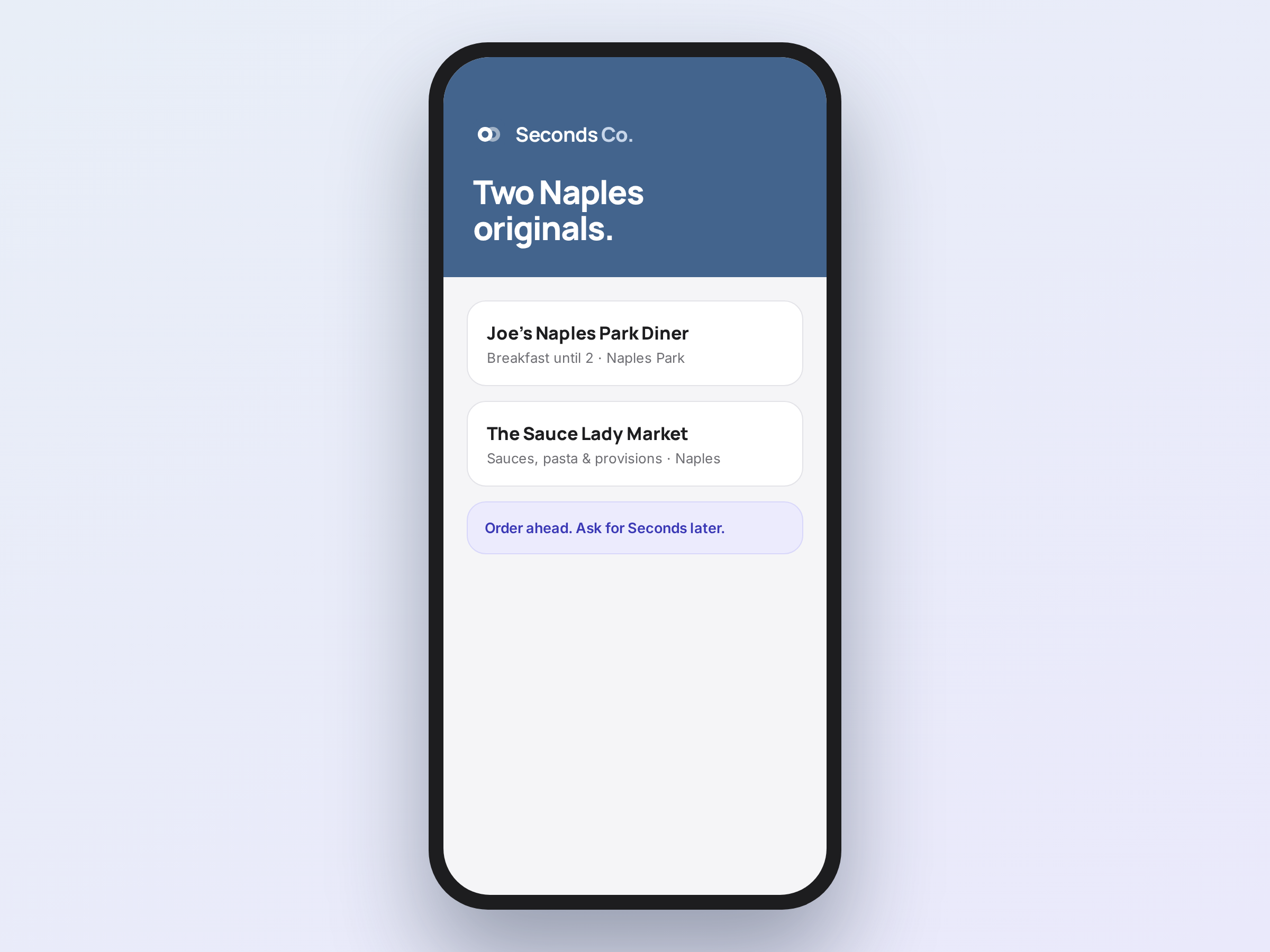
Two Naples Originals.
Good. Then seconds.
Open early. Stay late.
Same crew. Same care.
Good food. No spin.
Ask for the regulars' table.
Earned, every night.
Right and wrongSame message, our type and our voice versus neither.
Right
Free coffee with breakfast, all August.
Wrong
We're excited to announce our promotional beverage program!
Typeface Scale
Five heading steps, one eyebrow label, three text steps, two measures. Every heading in this book snaps to a step and nothing carries a size of its own. Three heading levels do all the work, and you never skip one.
Step
Size
Where it goes
--fs-display
140px, fluid from 36px
The hero headline. Once per document, never twice.
--fs-h2
88px, fluid from 38px
Section titles, and full bleed statements.
--fs-h3
60px, fluid from 30px
Headings inside a colour field.
--fs-h4
36px, fluid from 24px
Subsection titles on the page surface, and statements inside a panel.
--fs-h5
22px
Chapter card titles and typeface names.
--fs-eyebrow
12px uppercase, .14em tracked
The label that sits above a heading.
--fs-body
17px
Every paragraph in the book. There is no second body size.
--fs-small
13px
Captions, meta lines, download labels.
--fs-micro
11px
Chips, badges, numerals, icon labels.
How the type is set
1
The levels
Three heading levels do all the work, and you never skip one. h1 is the hero. h2 is a chapter title. h3 is a subsection title, set at --fs-h3 on a colour field and --fs-h4 on the page surface.
2
How it scales
Heading steps run fluid with clamp(). The ceiling is the step itself, so the scale holds from a 320px phone to a 1920px display. Leading is 0.94 on the display step, 1.04 on every other heading step, 1.62 on every text step. Nothing else.
3
The measure: 72ch
Body copy runs to --measure. A ch is the width of a zero, so 72ch lands in the 66 to 75 character band that reads easiest. Set it in ch and it tracks the font instead of drifting when a size changes.
4
The narrow measure: 44ch
Copy inside a card runs to --measure-narrow, 44ch. In most grids the card is narrower than that, and the card wins. That's the point. Two prose measures, three heading caps. Never a third measure, never a fourth cap.
The system · 03 · The logo
Two plates. One asking for more.
A full plate, and a second one arriving. The whole idea, drawn plain: someone asked for more.
Three words, three things. The icon is the two plates on the tile. The wordmark is the name, set in Manrope. The lockup is the two together, and it's our signature.
The lockup
Seconds Co.
The lockup: the first plate, the second arriving, the name. Manrope 700 and 800. Never smaller than 120px wide.
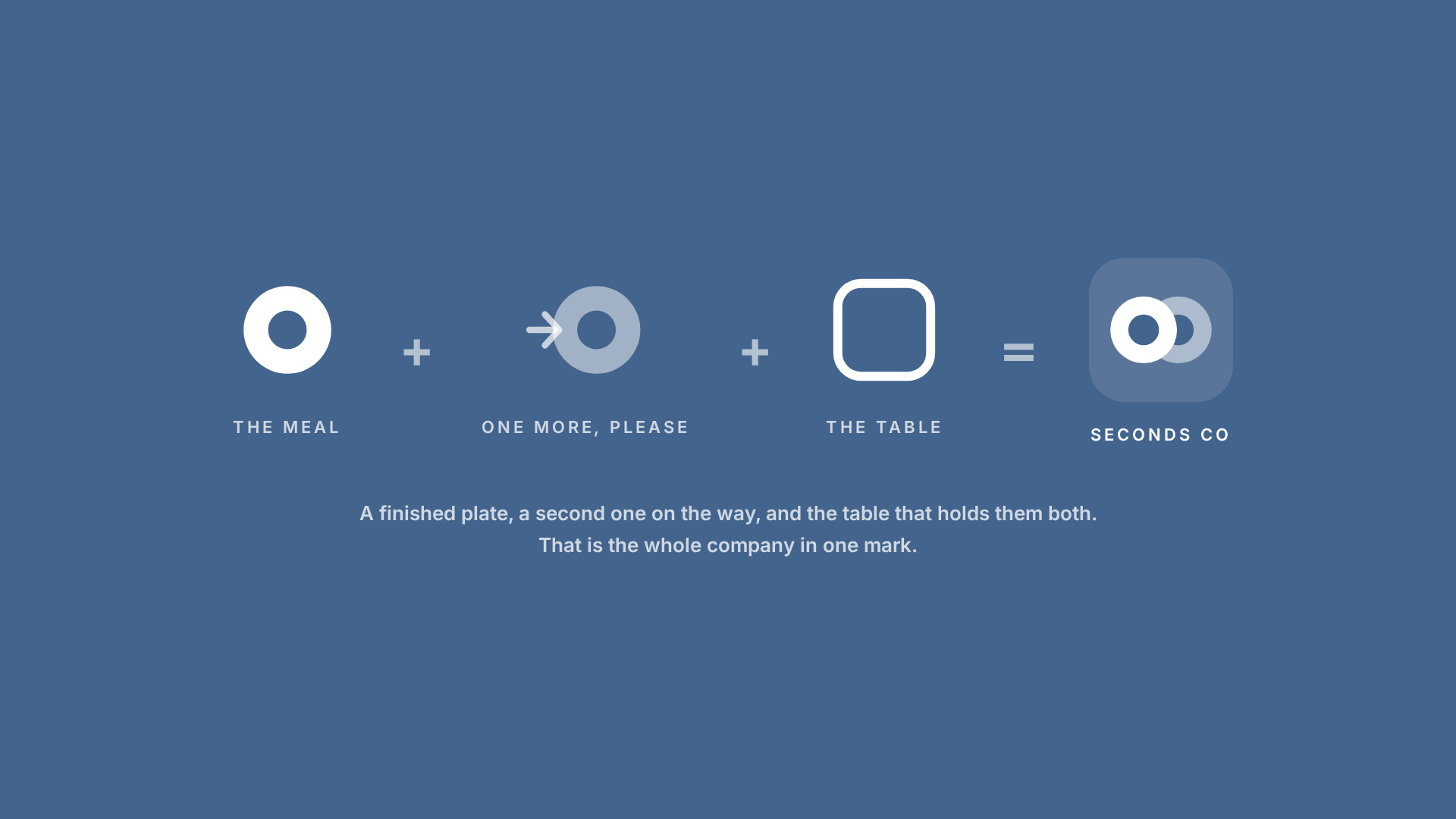
Three things from every good meal, added up. The plate you finished. The plate you asked for. The table you sat at. Read it left to right, and the name explains itself.
The mealThe plate you finished.
+
One more, pleaseThe plate you asked for.
+
The tableThe one you sat at.
=
Seconds Co
A finished plate, a second one on the way, and the table that holds them both. Nobody asks for seconds to be polite, and the icon says that before a word does.
The meaning is above. This is the mechanics: how much air the lockup needs, how the two parts relate to each other, and the smallest it is ever allowed to go.
The exclusion zone
Nothing enters the zone. × equals the width of the small plate. It is the minimum; give the logo more room whenever you can.
Construction
The space between icon and wordmark equals the plate hole (o). Icon and wordmark never move, resize, or recolour relative to each other.
Lockup · digital Never below 120px wide.Lockup · print Never below 30mm wide.
Icon · digital Never below 24px. Favicon uses the 256 PNG.Icon · print Never below 8mm.
The animated mark
On heroes and covers the mark comes alive: the plates stay put and the background shifts skin. Pick one skin per surface, never mix them in a single view. At small sizes and in print, use a single flat skin.
Denim
Default. The everyday mark.
Indigo
Campaigns and launches.
Mint
Fresh moments and product news.
Expressions. Which one, when.
Twenty-nine expressions, one geometry under every one. Eight make up the core set: six everyday files, and two for campaigns. The other twenty-one are the extended set, for campaigns and big moments. One expression per piece, never as the app icon.
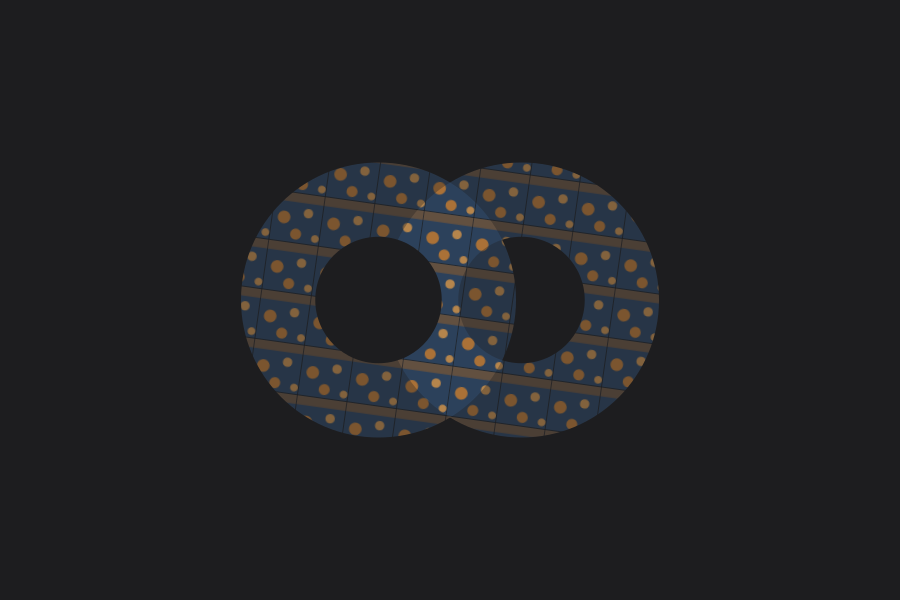
Warm food patternMenus and food-photo frames. The only place gold appears. SVG
Misuse. Never these.
The icon travels everywhere: profiles, decks, print, partner lockups, guest photos. Check before you ship.
Never
Recolour it.
Stretch, squash, or distort it.
Rotate any part.
Add shadows, bevels, or effects.
Rebuild the wordmark in another font.
Put it on a photo without a wash behind it.
Shrink it below 24px on screen, or 8mm in print.
Reuse an old single-plate file. There is one current icon.
Watch the traps
Profile pictures: centre the icon with room to spare, so the crop never clips the second plate.
Blue Aura gradients: use Reversed on a flat colour. The denim icon on the gradient fights itself.
Slides: paste as a locked image so the theme can't recolour it.
Partner lockups: equal weight, equal space, and the exclusion zone still applies.
Over food photos: use the Tint expression, low opacity, in a corner. Never centred over the plate.
Do
Lockup on white, Surface, or Tint backgrounds.
Icon alone for avatars, favicons, and stamps. Minimum 24px.
Logo and type share a left edge, aligned flush.
The system · 04 · Visual elements
The plates do the talking.
One plate down, a second on its way. Seven elements, drawn from the icon and the palette.
Ordered-list marker
1
2
The plate pair: a dash, then a number or letter. For steps and ranked sets. If the order doesn't matter, use plain text.
Section divider
Asking for Seconds: a full plate, a second sliding in, a rule that fades out. Use it anywhere you'd draw a line.
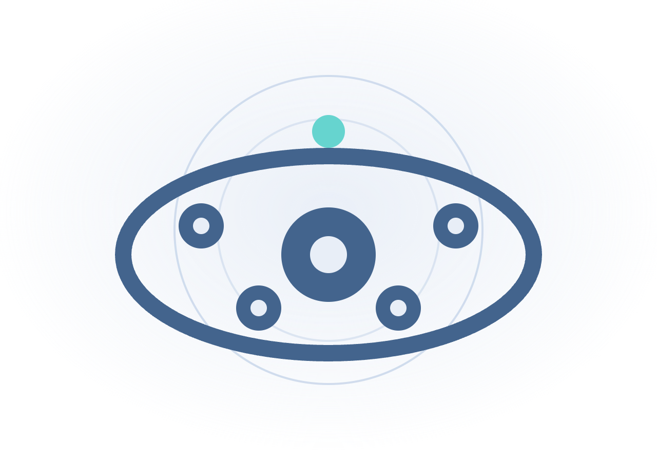
The aura
Ripples from a plate, the buzz around a good table. Moves on screen, holds still in print.
The dash
Read me first
Every eyebrow opens with it: the pause before you say the thing. Indigo by default.
The Seconds stripe
Denim, mint, indigo in one thin band. Footers and cover edges. Never thicker than 10px.
Callouts
Indigo is attention. The one thing the reader cannot miss.
Cyan is quiet information. Context, notes, asides.
Indigo for attention, cyan for quiet info. Two only. Nothing orange.
The pill
DenimIndigoCyanMintNeutral
A small rounded label for status and tags. Tint fill, hairline, one colour. Denim by default; indigo, cyan, mint, or neutral when a status needs its own.
The system · 05 · Illustration
The illustration set.
Two tiers, one language. Scenes fill a hero, a deck cover, or a post. Spot marks sit inline, in cards, as accents. Circles and arcs from the icon, one accent, lots of air.
The scenes
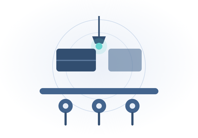
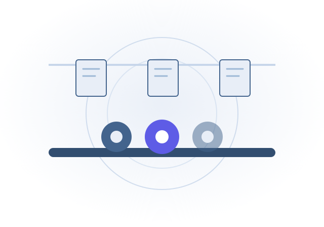
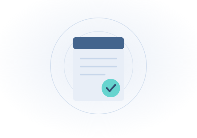
Five editorial scenes for heroes, decks, and posts. Flat, Blue Aura, one accent each.
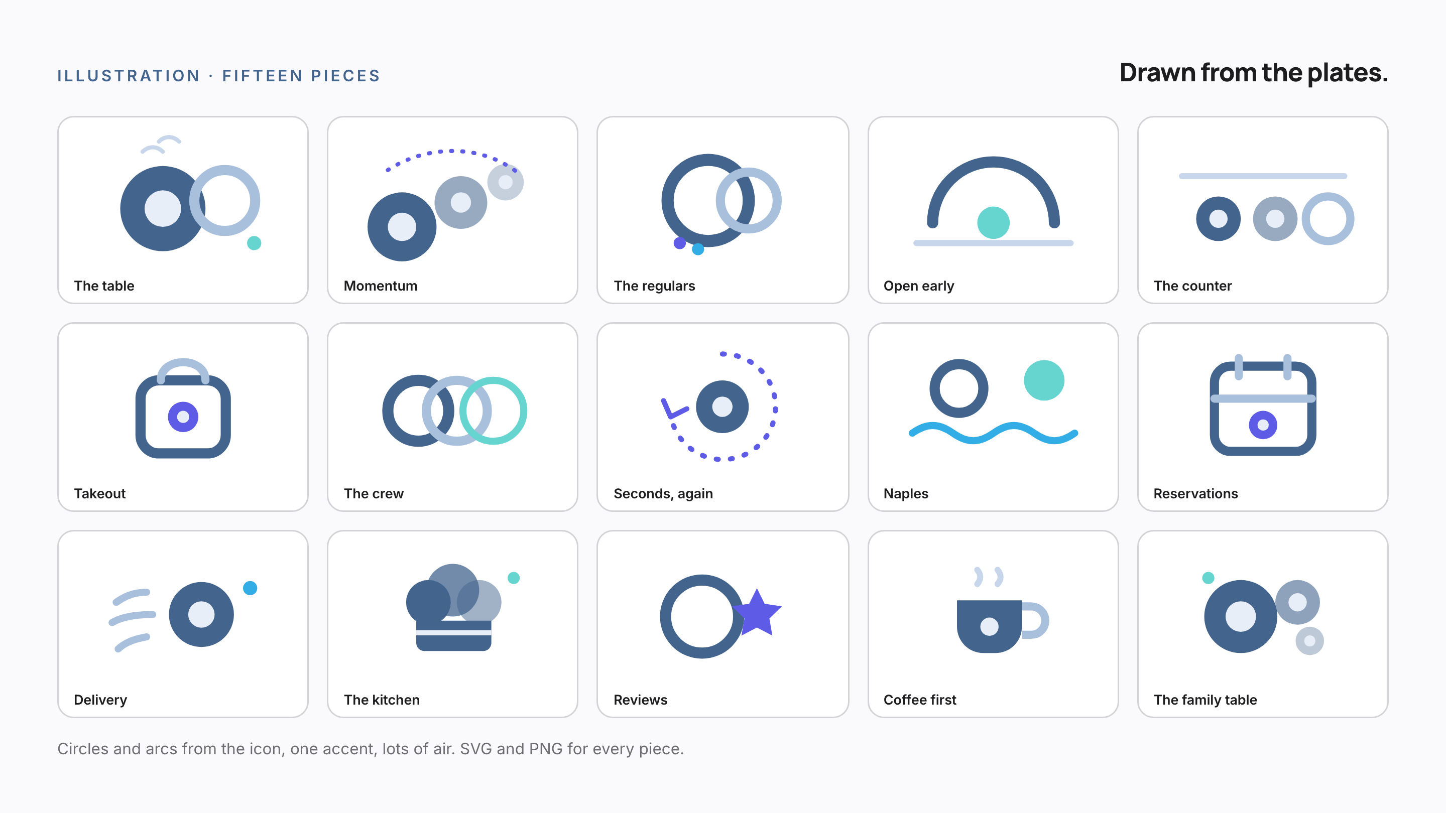
Twenty-four marks, one recipe: a 24px grid, a 2px rounded stroke, Ink on white, and one dot of colour at most. That is how a set this size still looks like one hand drew it.
Draw on the 24px grid, 2px stroke, rounded caps and joins.
Ink on white or Surface. Denim when active or selected.
Keep shapes open and simple; one idea per icon.
✗Don't
No filled icons, no two-tone, no gradients inside icons.
No mixing stroke weights or borrowed icon sets.
No more than one accent dot, ever.
The system · 07 · Photography
Shot in our own rooms.
Photography has two jobs: show the real room, and pull every shot into the brand. Three tints, three libraries, and a shot list that covers every kind of post we make.
Nothing here is ever stock.
The tints
Three overlays that pull any photo into the brand. Each is a PNG you layer on top in Apple Photos, Canva, or Adobe Express. Download, drop on, done. The tool does not matter. Default filters and sticker effects do, so leave them off.
Denim tint · corporate
Indigo dusk · campaigns
Gulf cyan · Naples
The shot list
A shoot plan, not a library. Twelve frames we will shoot ourselves, grouped by tint, shown as provisional stand-ins until the cameras roll.
Seconds HQ · denim tint
The morning huddle · Planned shoot · provisional
Menu planning at the pass · Planned shoot · provisional
Restaurant OS, in the back office · Planned shoot · provisional
Closing the books after service · Planned shoot · provisional
Restaurants · indigo dusk
Taking the order · Planned shoot · provisional
Punching in for the shift · Planned shoot · provisional
Checking in a guest · Planned shoot · provisional
The meal, enjoyed · Planned shoot · provisional
Naples · gulf cyan
The pier at dusk · Planned shoot · provisional
Gulf water · Planned shoot · provisional
Naples Park streets · Planned shoot · provisional
Palms & light · Planned shoot · provisional
What every shot needs
The compositional rule. Every frame earns its place with these four.
1
The hero plate.
Overhead and 45°, tight enough to feel the texture.
2
Hands.
Serving, passing, tearing bread. People eat with people.
3
The table mid-meal.
Half-finished plates, crossed forks. The ask-for-Seconds moment.
4
The room and the people.
The counter, the regulars, the crew. Real faces, no posing.
Specs
Minimum 1200×800, JPEG, natural light first.
Uber Eats cover: 2880×2304 (5:4), food only, no people, no logos.
Every dish in landscape and square crops. Keep originals.
Never
Stock photography. One stock burger kills the whole promise.
Cold, blue-tinted food. If it looks refrigerated, reshoot it.
Heavy filters, fake steam, cluttered prop flat lays.
The system · 08 · Voice
Say it like you mean it.
How we sound
Write like you talk to a regular at the counter. Someone who comes in twice a week. You do not pitch them. You do not perform for them. You tell them what is good today, you say it once, and you mean it. Every caption, menu line, email, and job post gets held to that.
The four principles
Plain.
Short sentences. Concrete words. “Breakfast until 2.” needs no follow-up. It already said the thing.
Direct.
Verb first, no wind-up, no throat-clearing. If you would not say it to a regular's face, do not type it either.
Human.
We, not “the company.” Contractions are fine. Warmth is fine. The only thing that is not fine is distance.
Earned.
“70 years between them” beats “legendary” every time. Back the claim with the fact, or leave the claim out.
Say this, not that
We sayWe never say
We sayCome back for seconds.
We never sayIndulge in a curated, world-class culinary journey.
We sayThe photographer comes to you. Book a morning slot.
We never sayContent capture services will be coordinated on-site at your convenience.
We sayJoe's opens at six. The coffee is on at 5.40.
We never sayOur doors open at 6:00am following comprehensive morning preparation protocols.
We sayJoe's has fed Naples Park since day one. Ask anyone.
We never sayAn iconic, world-class culinary destination beloved by the community.
We sayBad batch of dough. We tossed it and started over.
We never sayWe maintain rigorous quality assurance protocols at every stage of production.
We sayClosed Mondays. See you Tuesday.
We never sayPlease note that our operational hours are subject to periodic adjustment.
Writing the name
It is “Seconds Co” everywhere, capital S, capital C. Never “Seconds” on its own, never possessive, never a verb. One name covers both arms of the company, the restaurants and the software. The restaurants keep their own names: Joe's Naples Park Diner and The Sauce Lady Market are separate businesses, and both get written out in full.
If it would sound ridiculous said across a counter, it does not get written down.
One brand, three voices
One brand, three voices. Seconds Co is the operator, calm and direct. Joe's Naples Park Diner and The Sauce Lady Market each get their own guide. Never blend the three.
The kit · 01 · Social kit
Look like us everywhere.
Every profile we run, already on brand. Avatars, covers, and post templates for LinkedIn, Instagram, X, and Facebook. Upload one as it comes, or hand it to a designer as the base layer.
The identity set
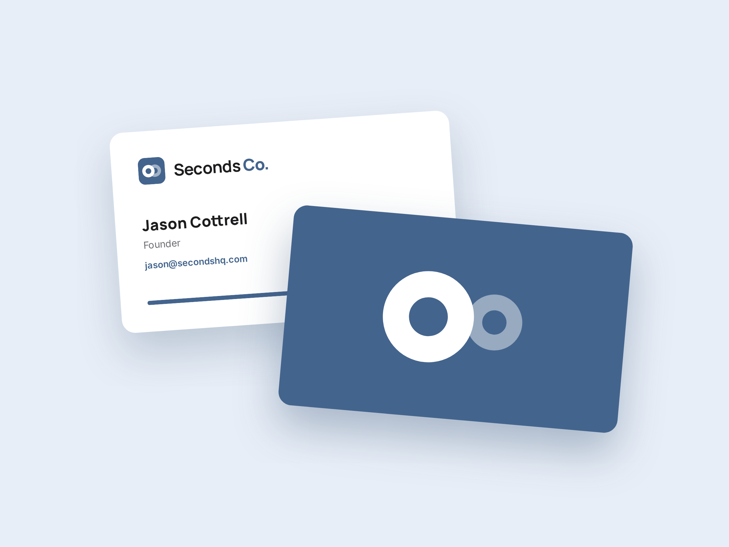
The files people grab first: the avatar and the lockup, each on three grounds. Transparent drops onto anything. Black is the Reversed rule, plates only, no tile. The email signature ships transparent so it sits on the message itself.
LinkedIn posts run the denim tint with a statement overlay. Restaurant pictures run indigo dusk. Naples pictures run gulf cyan with the stripe. Take the matching overlay from the Photography section and drop it on.
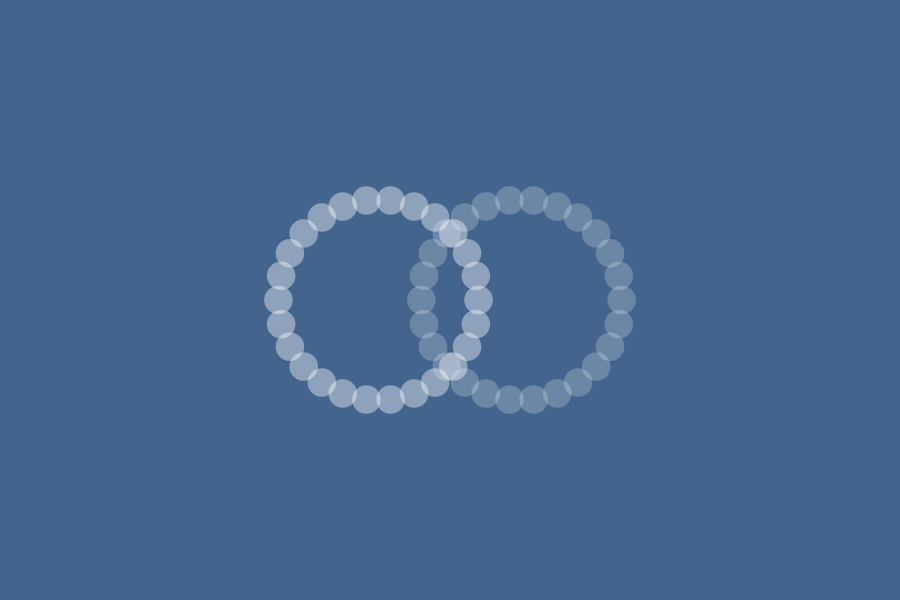
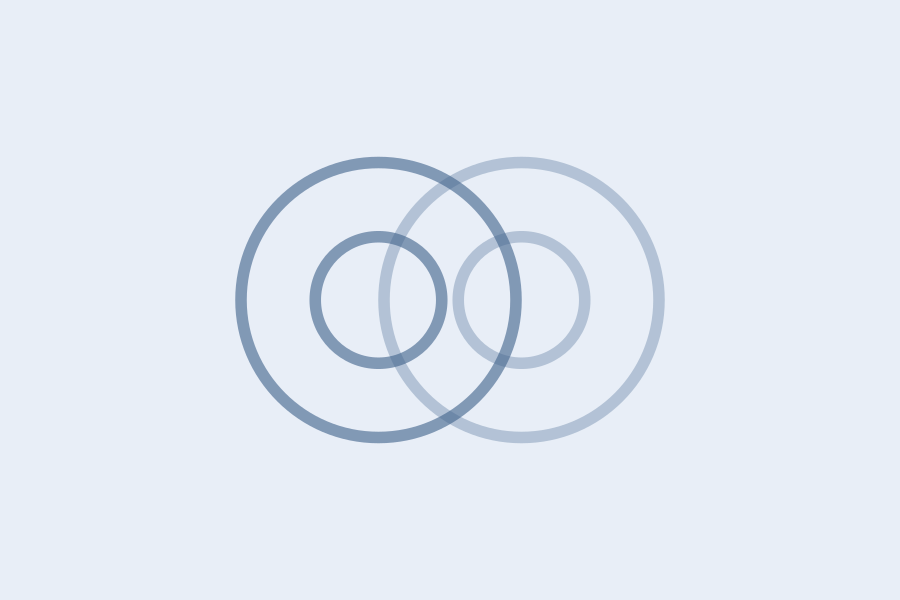
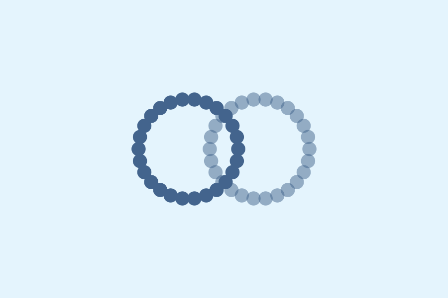
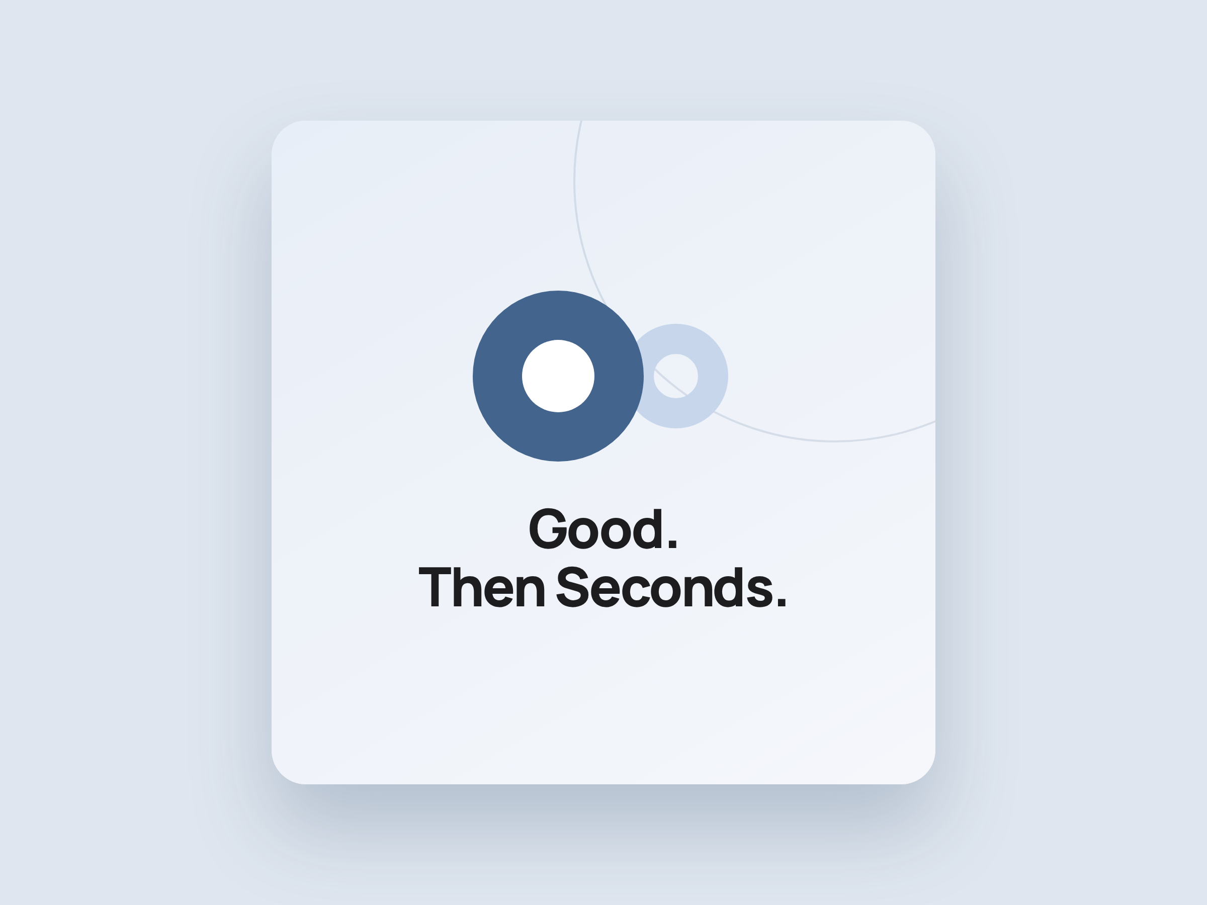
The expression system in the feed: statements, the dotted plate, mint moments, the ring pattern. Use for launches and campaigns; the covers above stay constant.
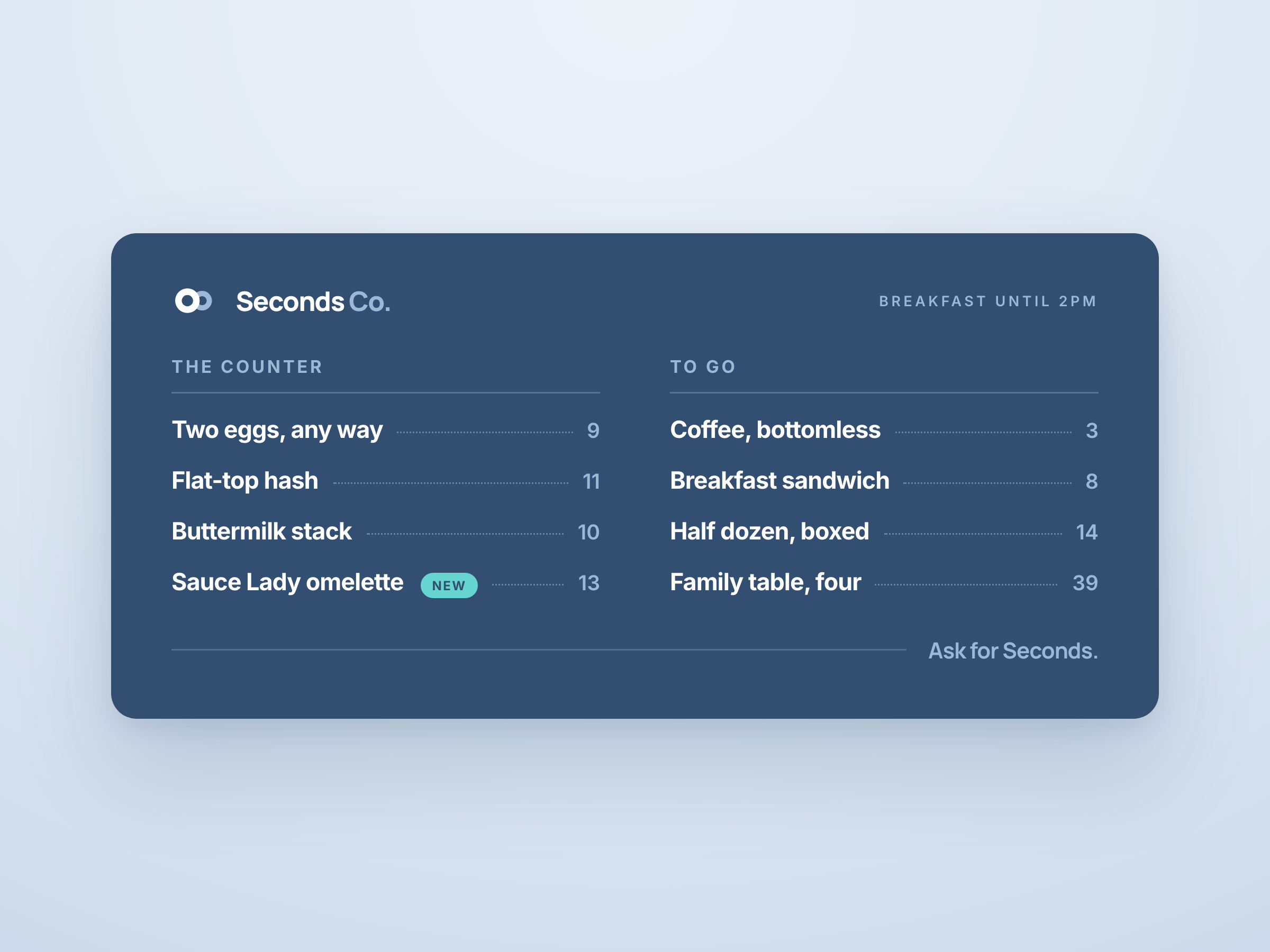
The menu board. Denim Dark, dotted leaders, one mint chip and that is the lot. PNG
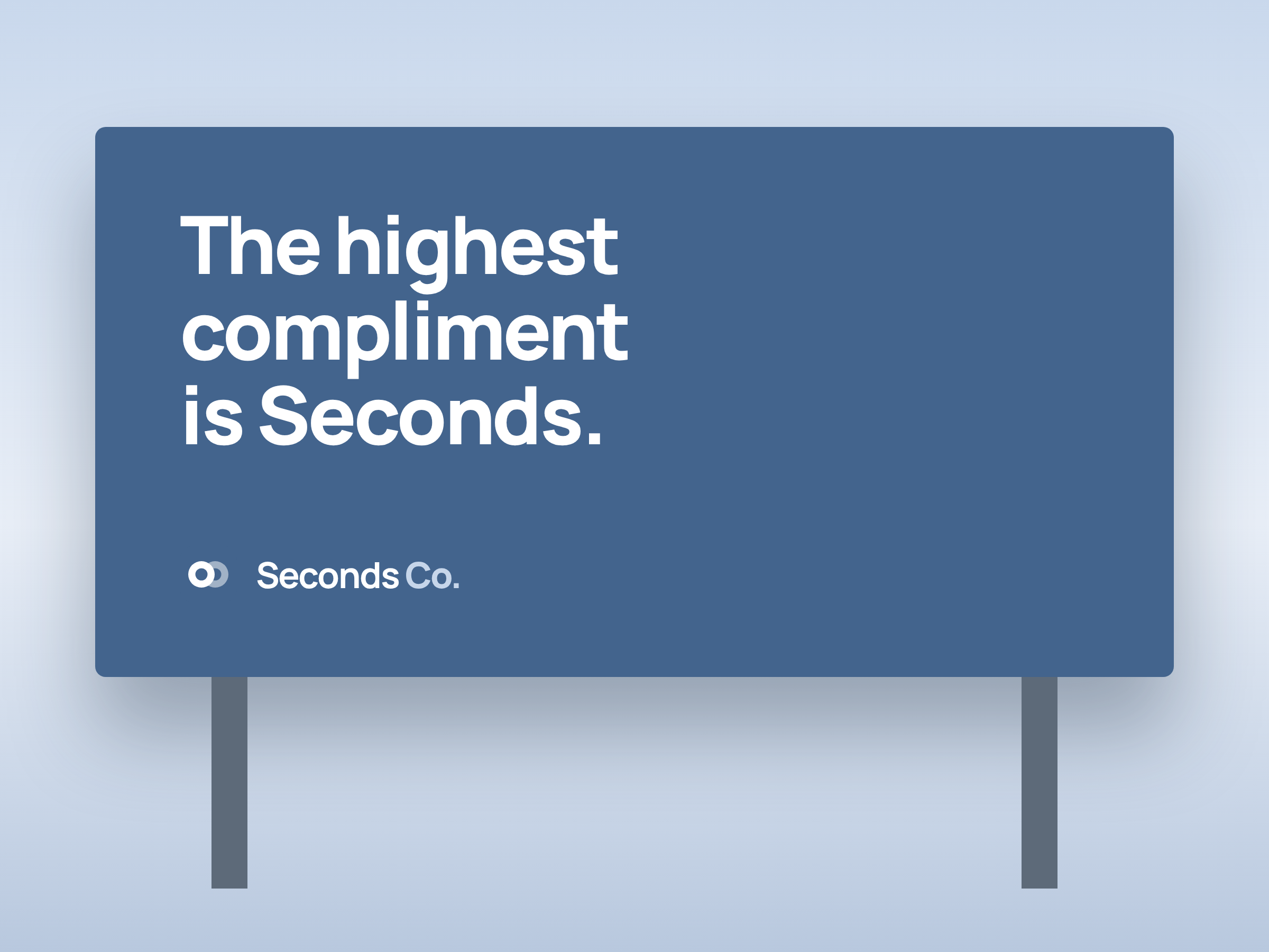
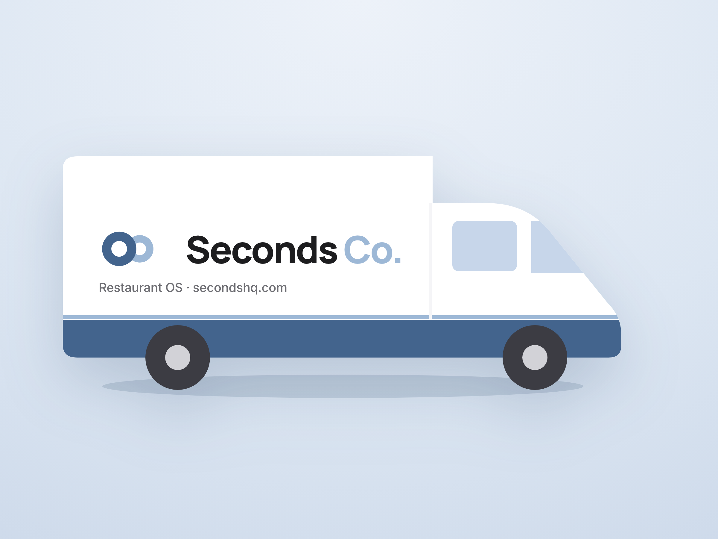
The van. Lockup on the cargo panel with a full plate of clear space on every side. PNG
The kit · 03 · Templates
Start from the template.
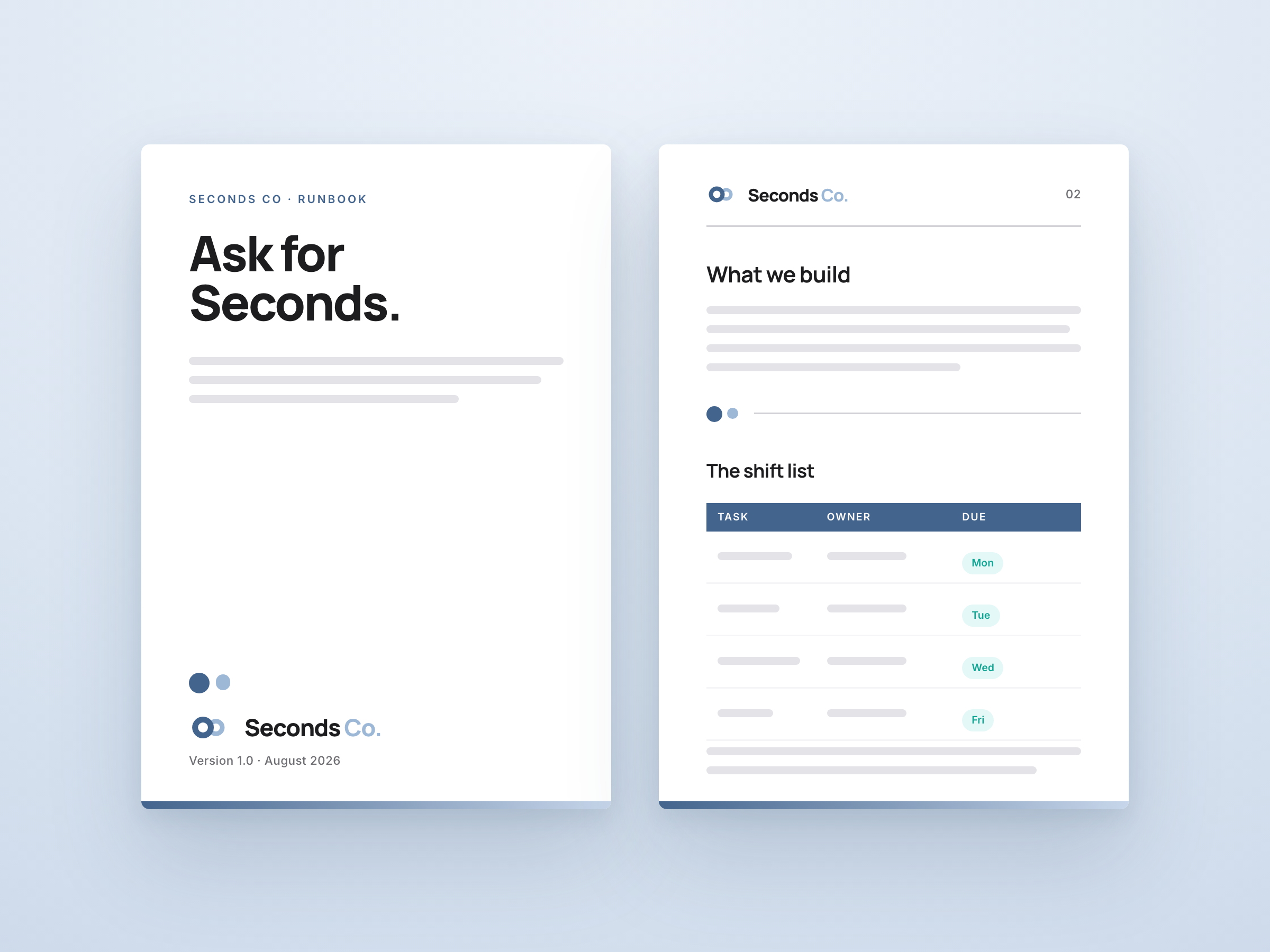
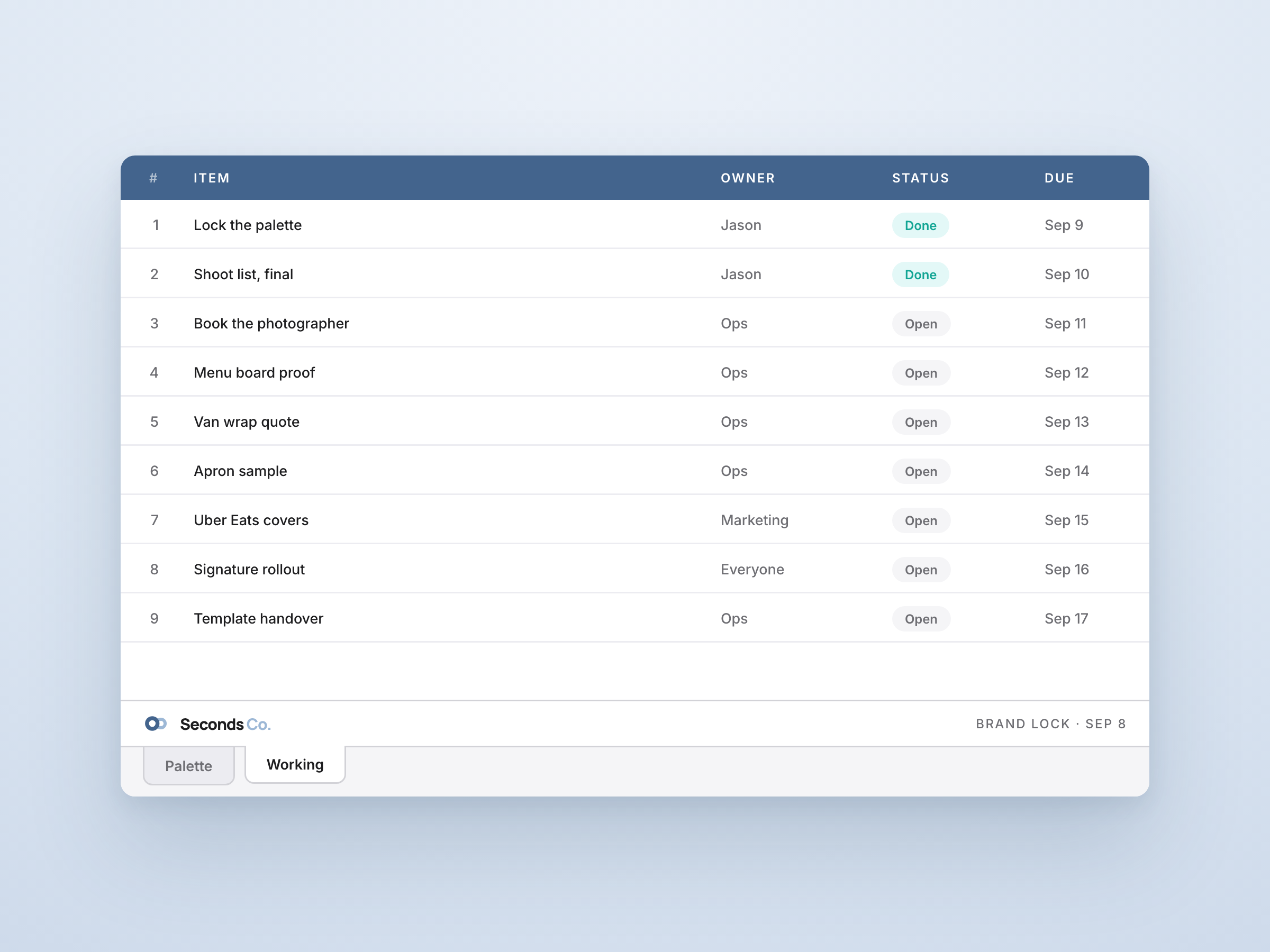
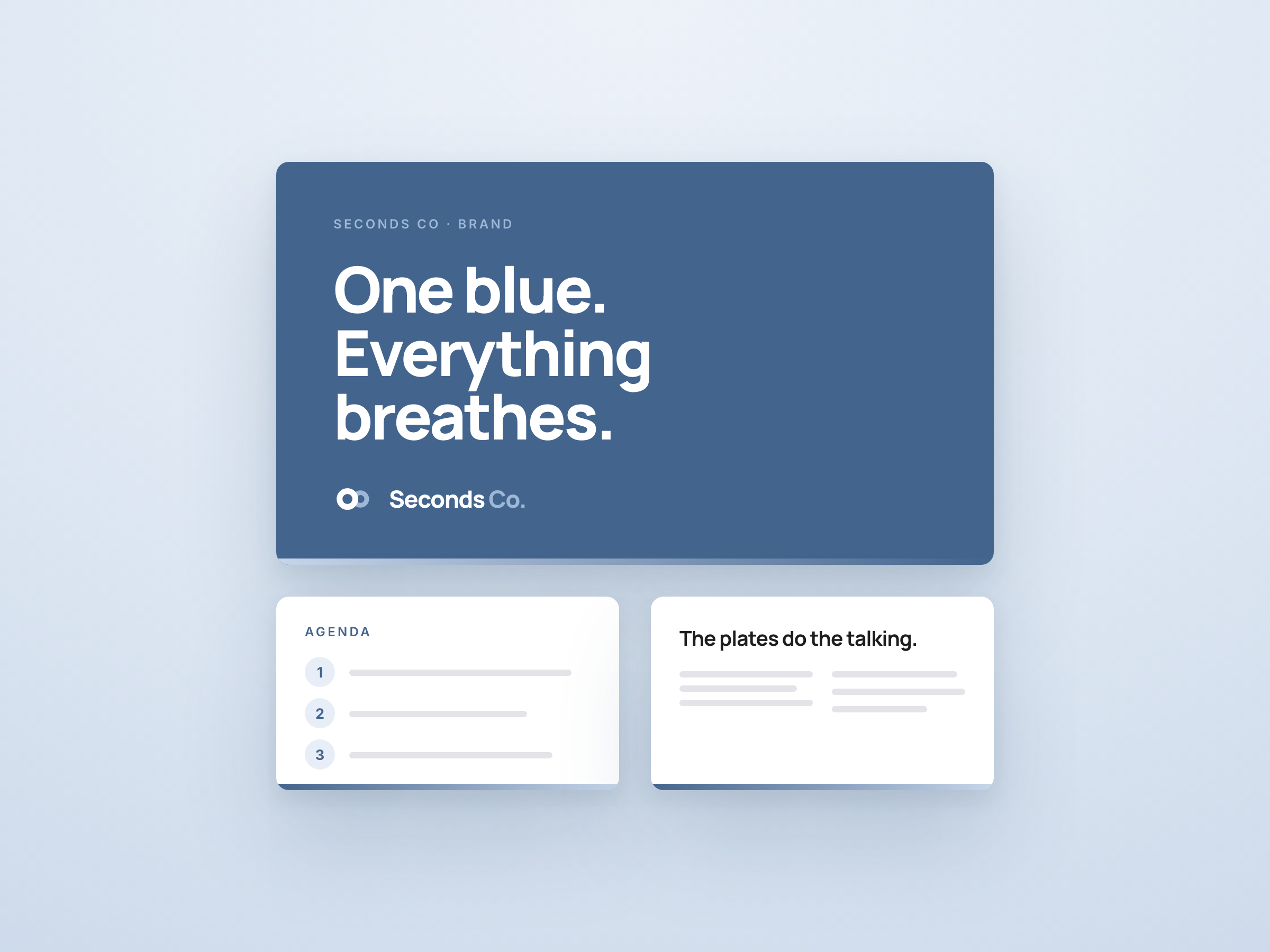
One document, one sheet, one slide deck, each built on the brand already. Start here instead of a blank page. Upload any of the three to Google Drive and it converts to Docs, Sheets or Slides with the branding intact.
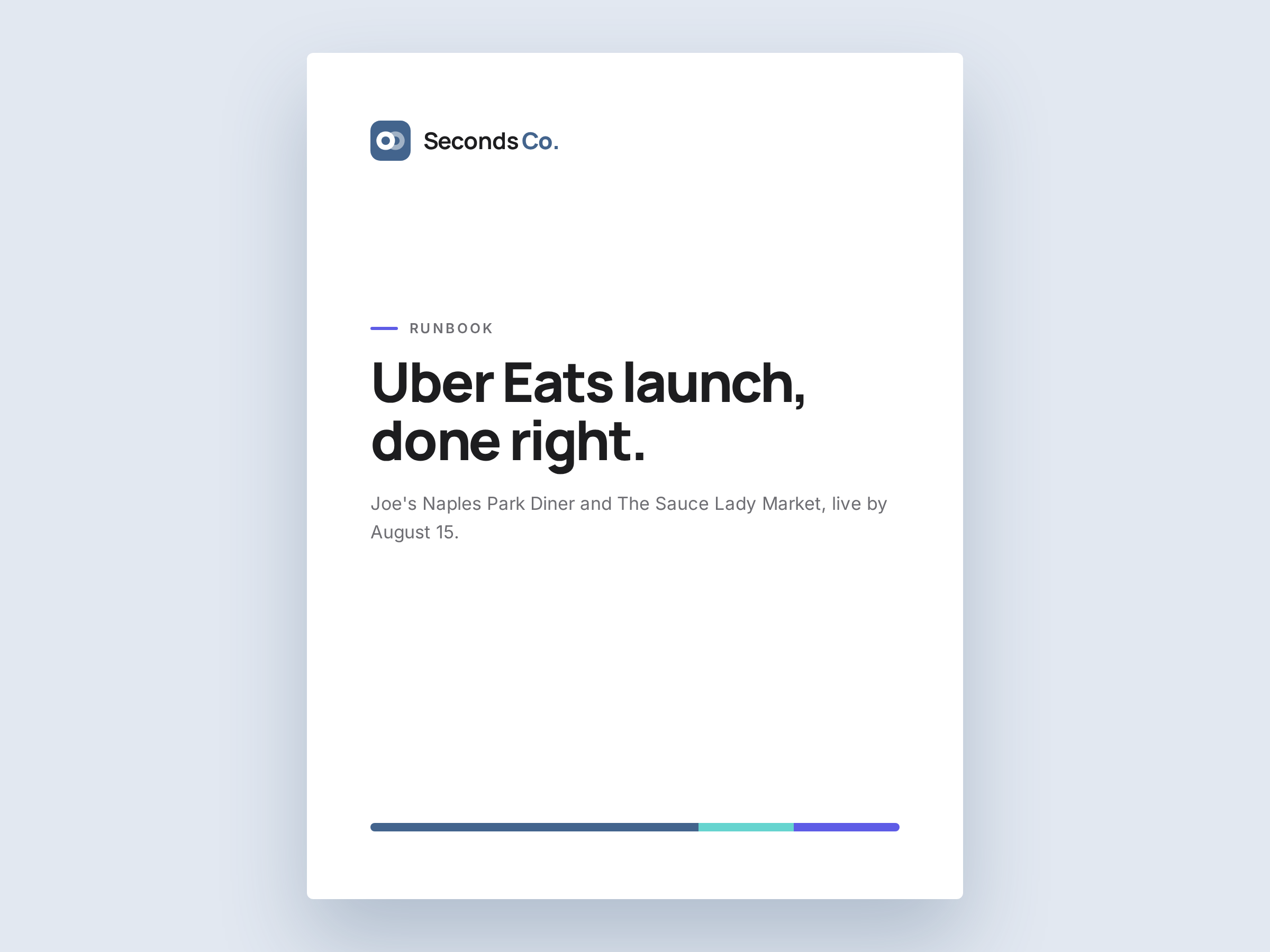
The Word template. Statement cover, plate dividers, stripe on the footer.
The Excel template. Denim header, palette tab, no borrowed spreadsheet styles.
The PowerPoint template. Statement cover, numbered agenda, one accent a slide.
Same rules on the inside. Every document, deck, board and workspace we touch starts from this book, not from a blank page.
1
Documents.
Every doc starts from the Seconds Co Word template in Templates. Runbooks, memos, offers, all the same skeleton.
2
Decks.
Statement covers on denim or brand art. One accent per slide. Numbered plates for agendas and steps. If a slide needs three colours, it needs two slides.
3
Project boards.
Numbered prefix, underscore, lowercase: 01_spring_menu, 02_hiring_push. Priorities use words, not colour soup.
4
Workspace.
Everyone runs the avatar, the Meet background and the email signature from the Social kit. Day one of onboarding, before the first meeting.
The kit · 04 · Downloads
Take the real files.
The files people ask for most often, all source-of-truth. The whole kit ZIP holds every asset in this book. Never screenshot the logo. It always looks worse and someone will notice.




















































































Look like us everywhere.
Every profile we run, already on brand. Avatars, covers, and post templates for LinkedIn, Instagram, X, and Facebook. Upload one as it comes, or hand it to a designer as the base layer.
The identity set
The files people grab first: the avatar and the lockup, each on three grounds. Transparent drops onto anything. Black is the Reversed rule, plates only, no tile. The email signature ships transparent so it sits on the message itself.
LinkedIn
Instagram
X (formerly Twitter)
Facebook
Everyday posts
LinkedIn posts run the denim tint with a statement overlay. Restaurant pictures run indigo dusk. Naples pictures run gulf cyan with the stripe. Take the matching overlay from the Photography section and drop it on.
Campaign posts
The expression system in the feed: statements, the dotted plate, mint moments, the ring pattern. Use for launches and campaigns; the covers above stay constant.
Google Workspace